
JOHN DYER GEMS
The goal was to create a unified, recognizable brand presence across all different avenues, including the logo, website, social media, and beyond. It was essential that the brand reflect the high level of sophistication, polish, and individuality that defines John Dyer Gems. As a respected name in the luxury gemstone space, the company needed a visual and verbal identity that truly lived up to its reputation. The goal was to update the logo so that it is more sleek and modern. It was important that the design to live up to the level of quality and precision that John Dyer Gems is renowned for. The goal was for the logo to feel timeless and stately.
John Dyer Part I: The Logo
The Client
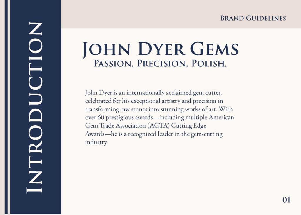
John Dyer is an internationally acclaimed gem cutter, celebrated for his exceptional artistry and precision in transforming raw stones into stunning works of art. With over 60 prestigious awards—including multiple American Gem Trade Association (AGTA) Cutting Edge Awards—he is a recognized leader in the gem-cutting industry.
John Dyer Gems, a family-owned business established in 1996, has been dedicated to creating beautifully cut gemstones for nearly three decades. The company offers a diverse selection of ethically sourced gemstones, including amethyst, aquamarine, garnet, tourmaline, and sapphire. Through innovative cutting techniques and a commitment to excellence, John Dyer Gems enhances the natural beauty of each stone.
The Problem
John Dyer’s logo, website, and brand identity are in need of an update. The first thing that comes to mind with John Dyer Gems is of course the image of a gemstone. However, using that imagery seemed cliche, and did not reflect the high end nature of the brand. The problem was trying to find a way to express the feel of gemstones, without using one directly.
The Outcome
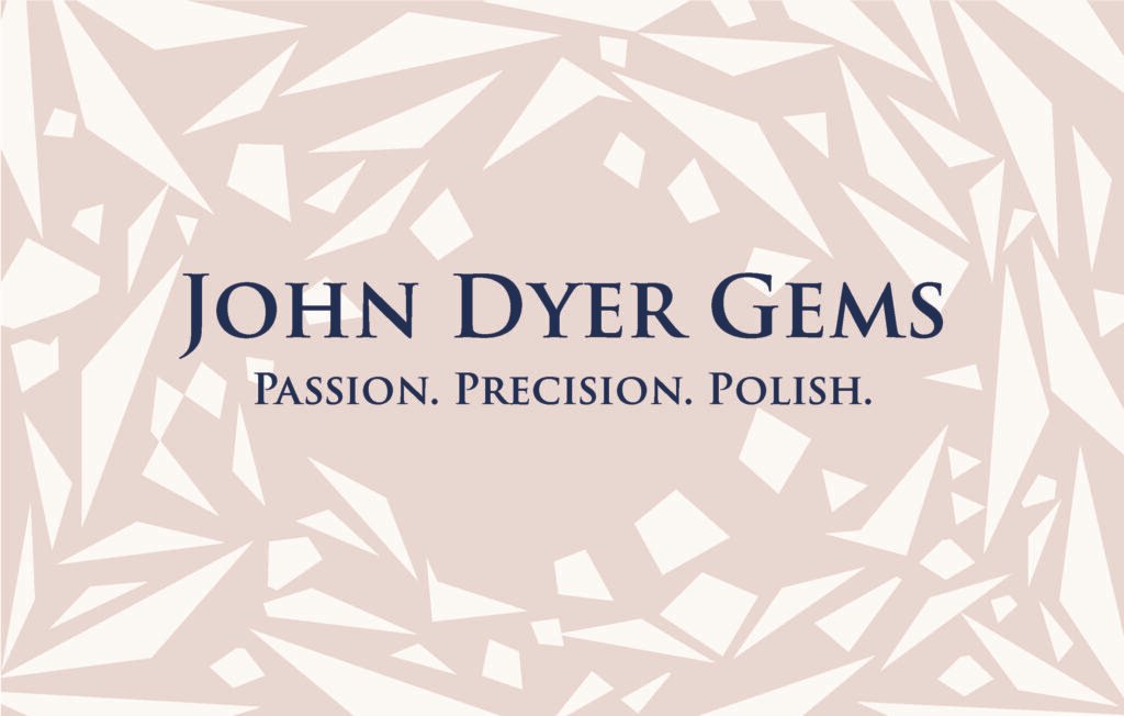
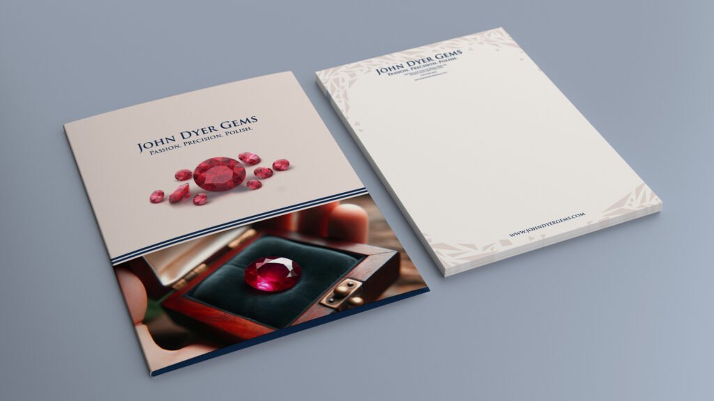
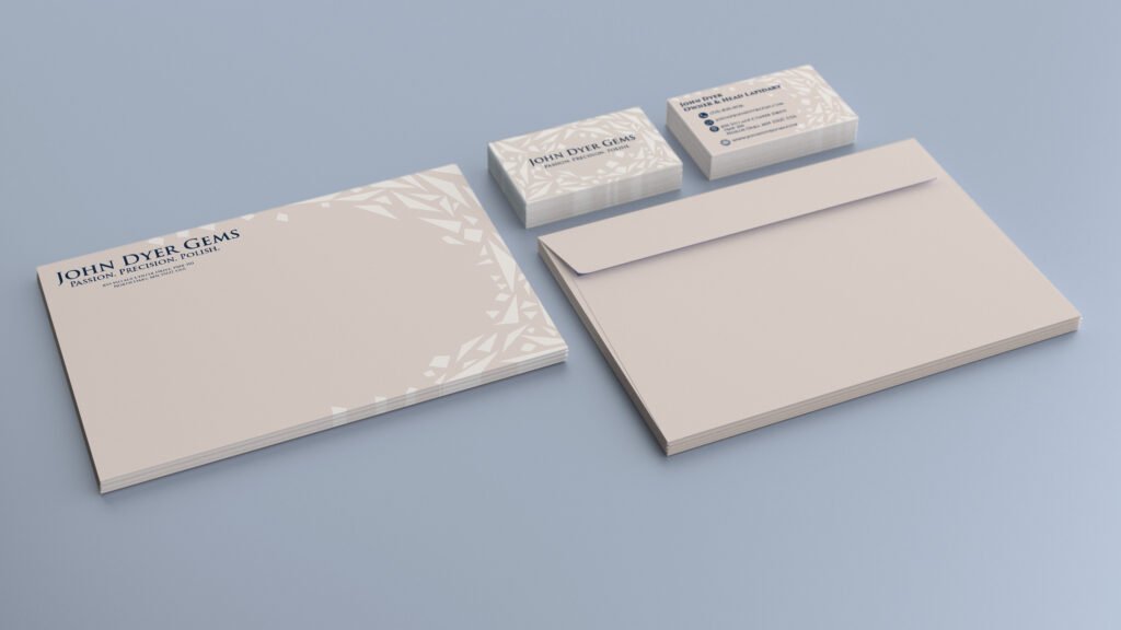
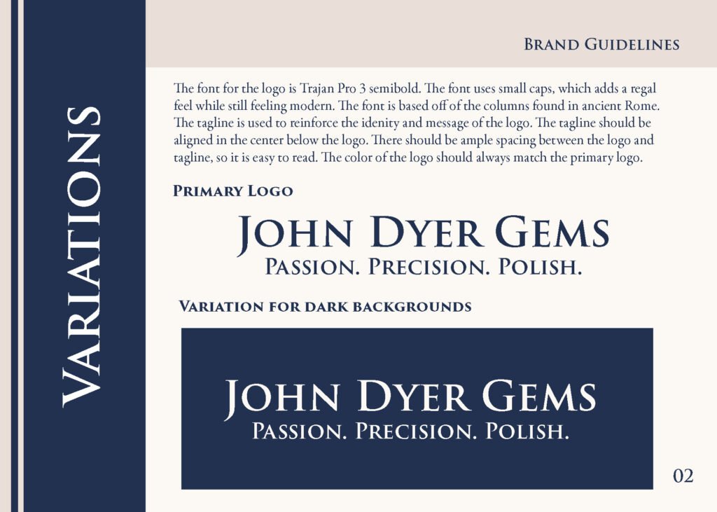
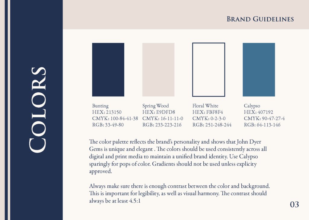
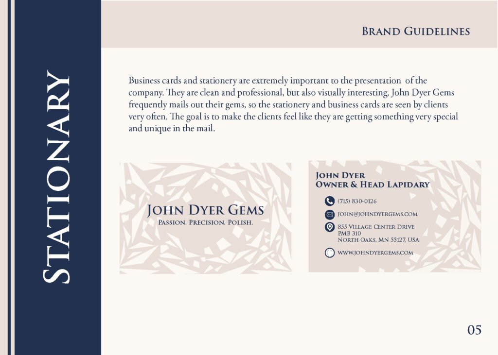
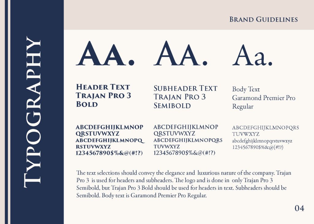
After careful consideration and many mockups, the client and I decided that it would be better to go with a wordmark for the logo. I wanted the logo to feel angular and precise, much like the gems themselves. The font for the logo is Trajan Pro 3 semibold. The font uses small caps, which adds a regal feel while still feeling modern. The font is based off of the columns found in ancient Rome. It is a lovely combination of elegant and timeless, while still feeling contemporary. The color used for the logo is a deep, rich blue that is remeniscent of the sapphires John Dyer Gems frequently use in their work. Using typography and color to show the personality of the brand was the best choice for the company.

John Dyer Part II: The Website
The Problem
The previous website, while functional and easy to navigate, felt outdated and lacked visual appeal. It didn’t reflect the exceptional quality of the company’s work or communicate the level of artistry and sophistication that John Dyer Gems is known for.
The Outcome
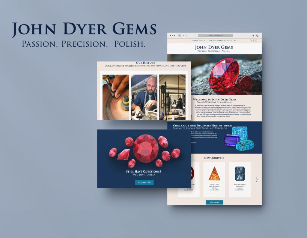
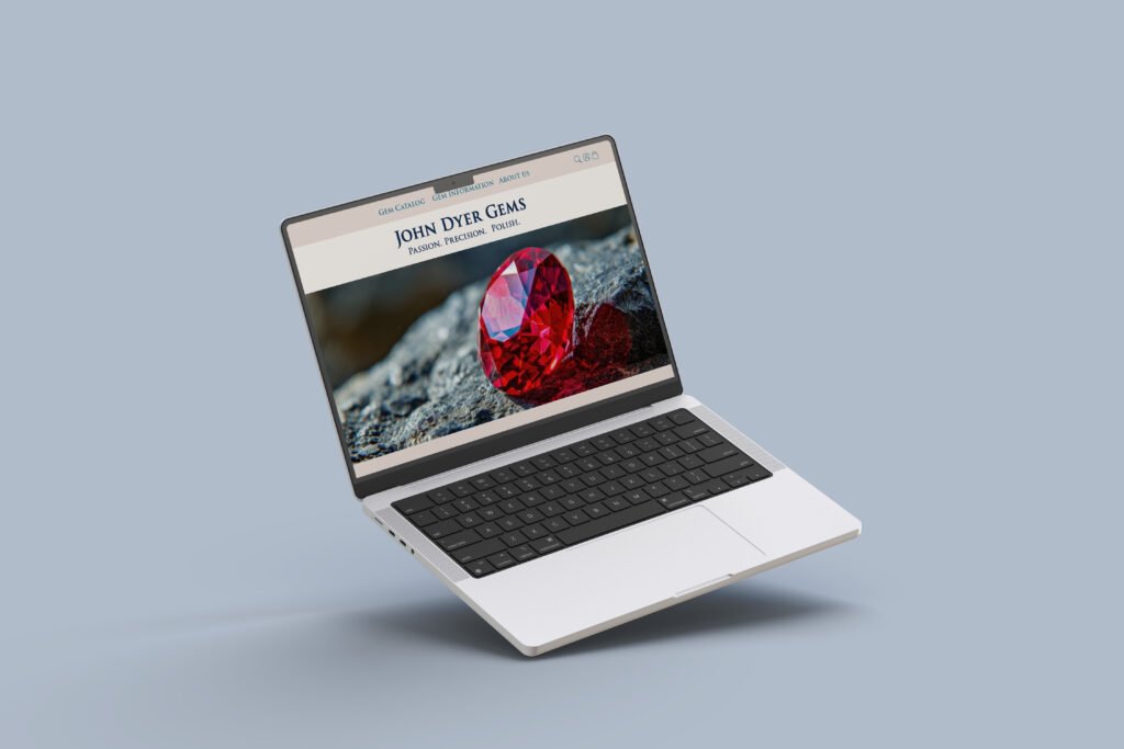
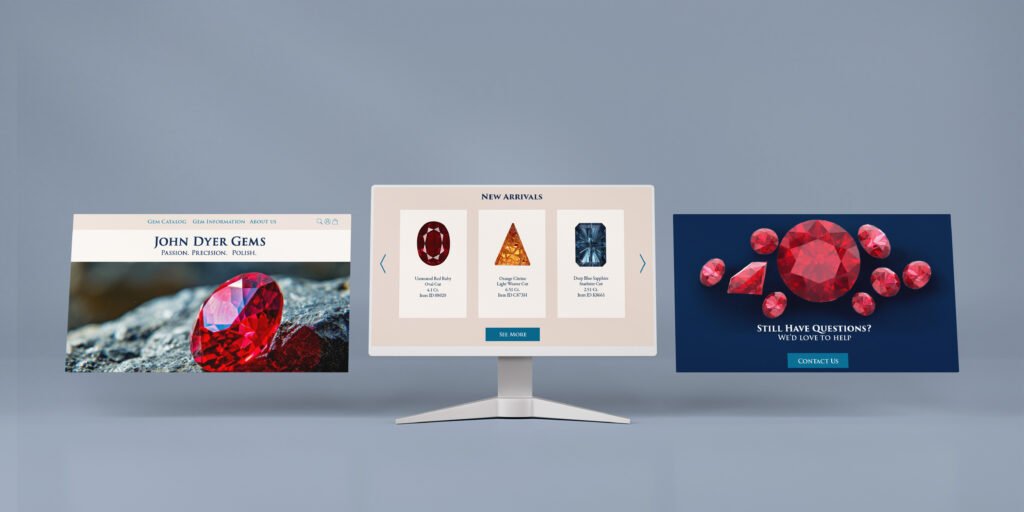
The new website offers a much stronger reflection of the John Dyer Gems brand. Emphasis was placed on craftsmanship, luxury, and artistic excellence. A neutral color palette—featuring shades of cream and tan—was chosen to allow the gemstones to take center stage. Carefully placed jewel-toned accents, such as a deep sapphire blue and an elegant teal green, were used to echo the vibrancy of the gems while adding richness and depth to the design. The final result is a sophisticated, visually striking website that highlights the brand’s values of precision, artistry, and trust—qualities that define both the gemstones and the legacy of John Dyer Gems.
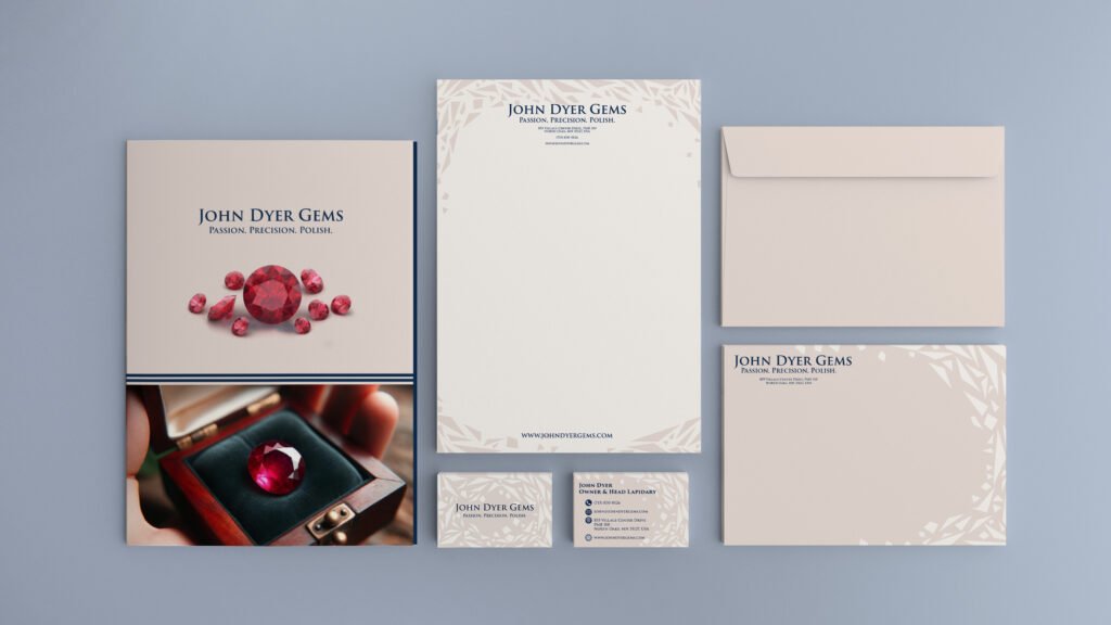
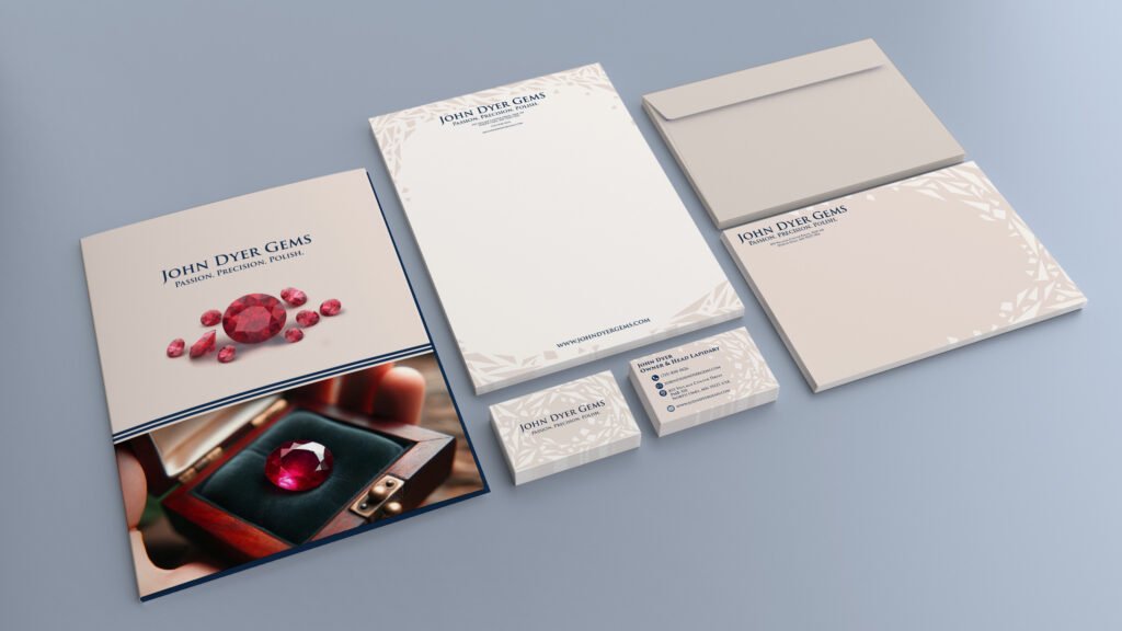
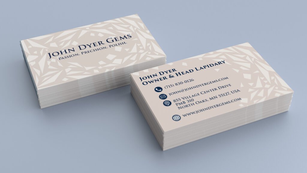
John Dyer Part III: The Brand Identity and Style Guidelines
The Problem
The brand’s messaging and visual presentation were inconsistent across platforms, diluting its image and making it harder to communicate the prestige and artistry the company is known for.
The Outcome
The refreshed brand identity now clearly conveys the artistry, innovation, and timelessness that John Dyer Gems stands for. It evokes a sense of legacy—an acknowledgment that these gems are not only exquisite works of art, but treasures meant to be cherished and passed down through generations.